Baker Boys
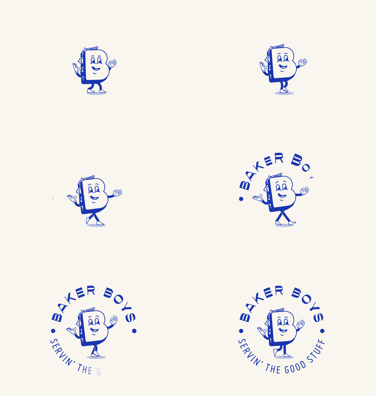
We were approached by Jane and Myles the owners of the popular seaside cafe Shells to create the brand and identity for their new Baker Boys project. The premises is situated in the dock / industrial area of Sligo town. We took inspiration from 80’s style American diners as well as creating a mascot style sandwich character called ‘Billy Baker Boy’ who is also the shape of a ‘B’.
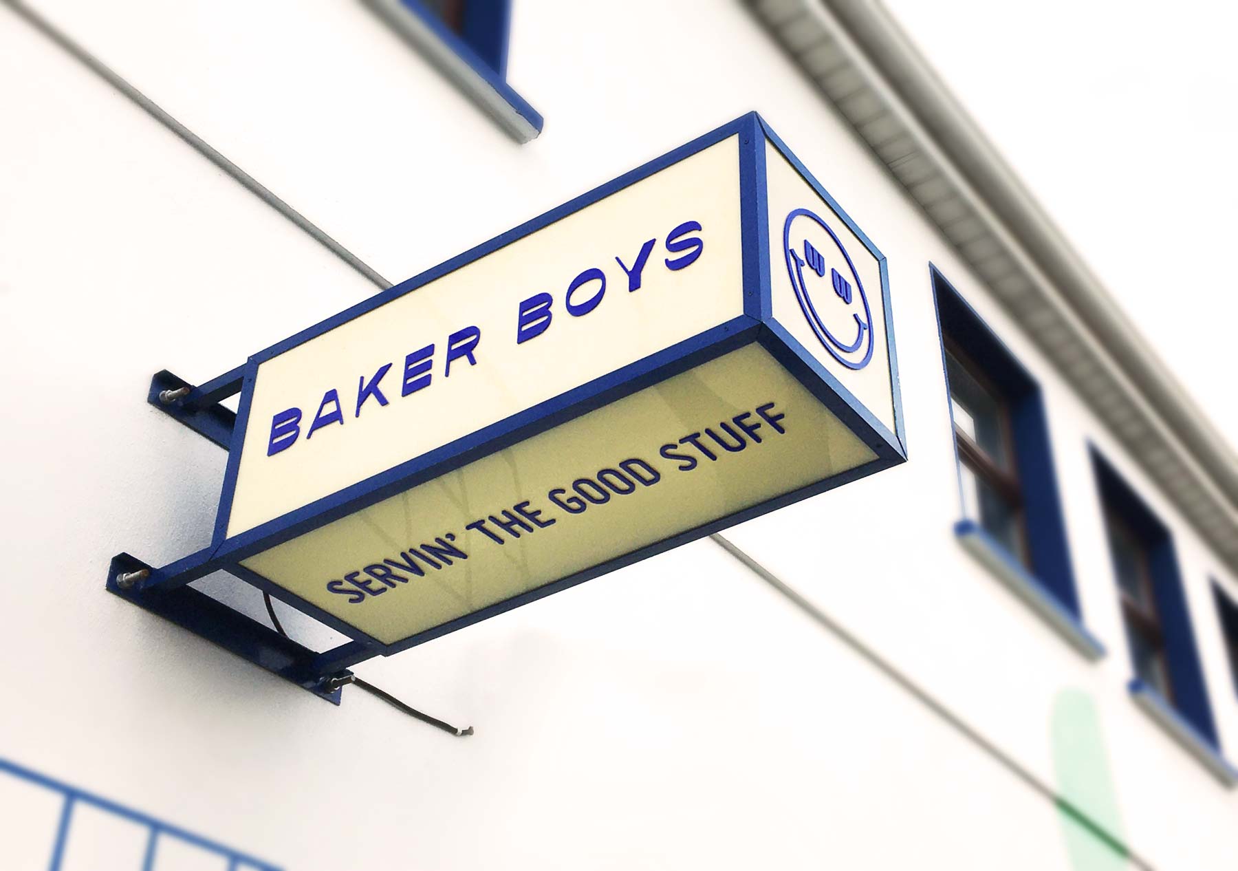
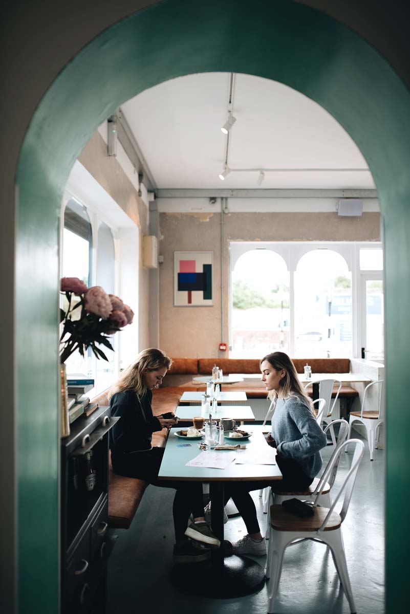
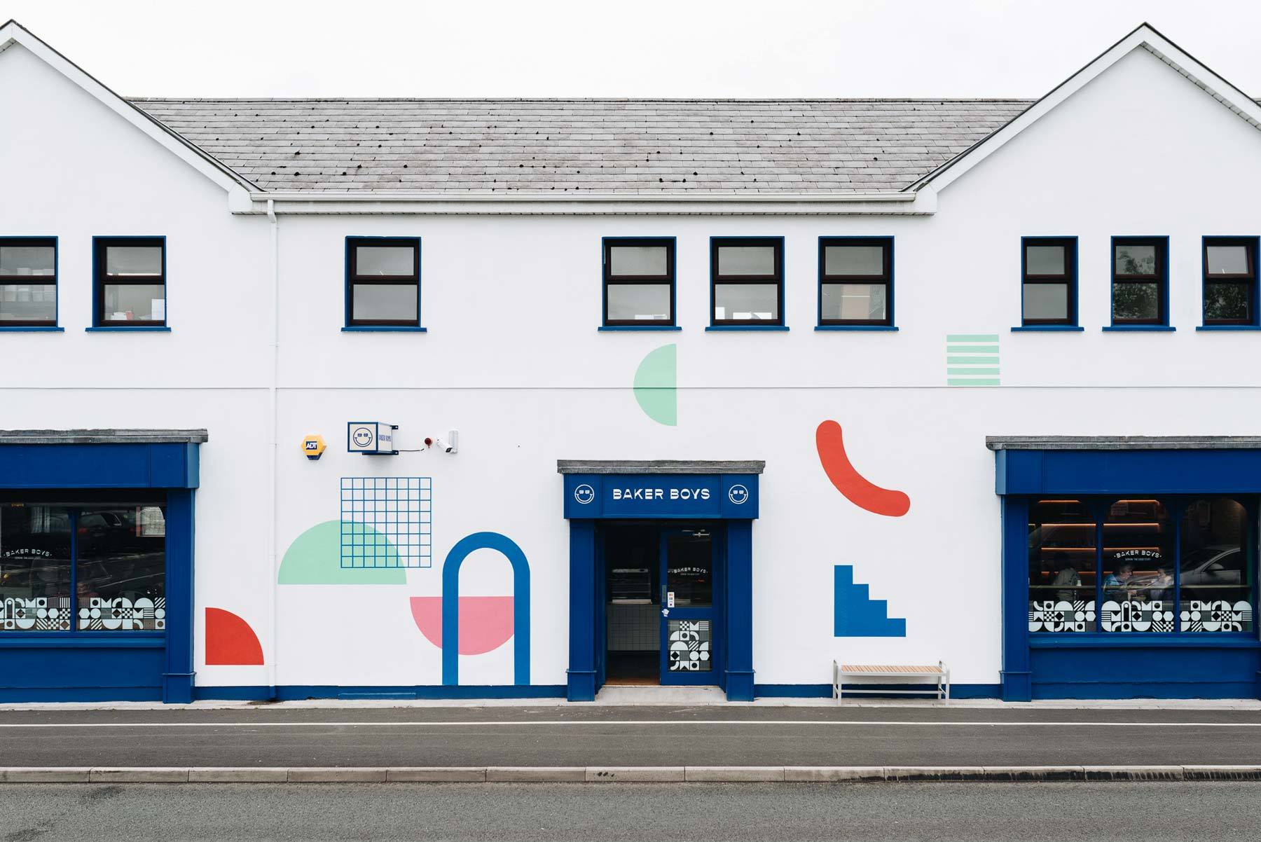
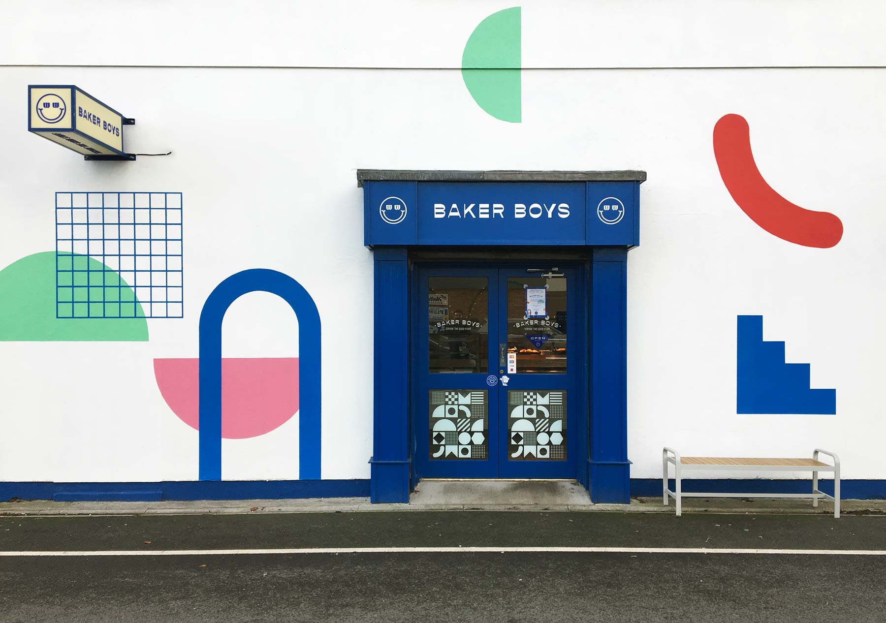
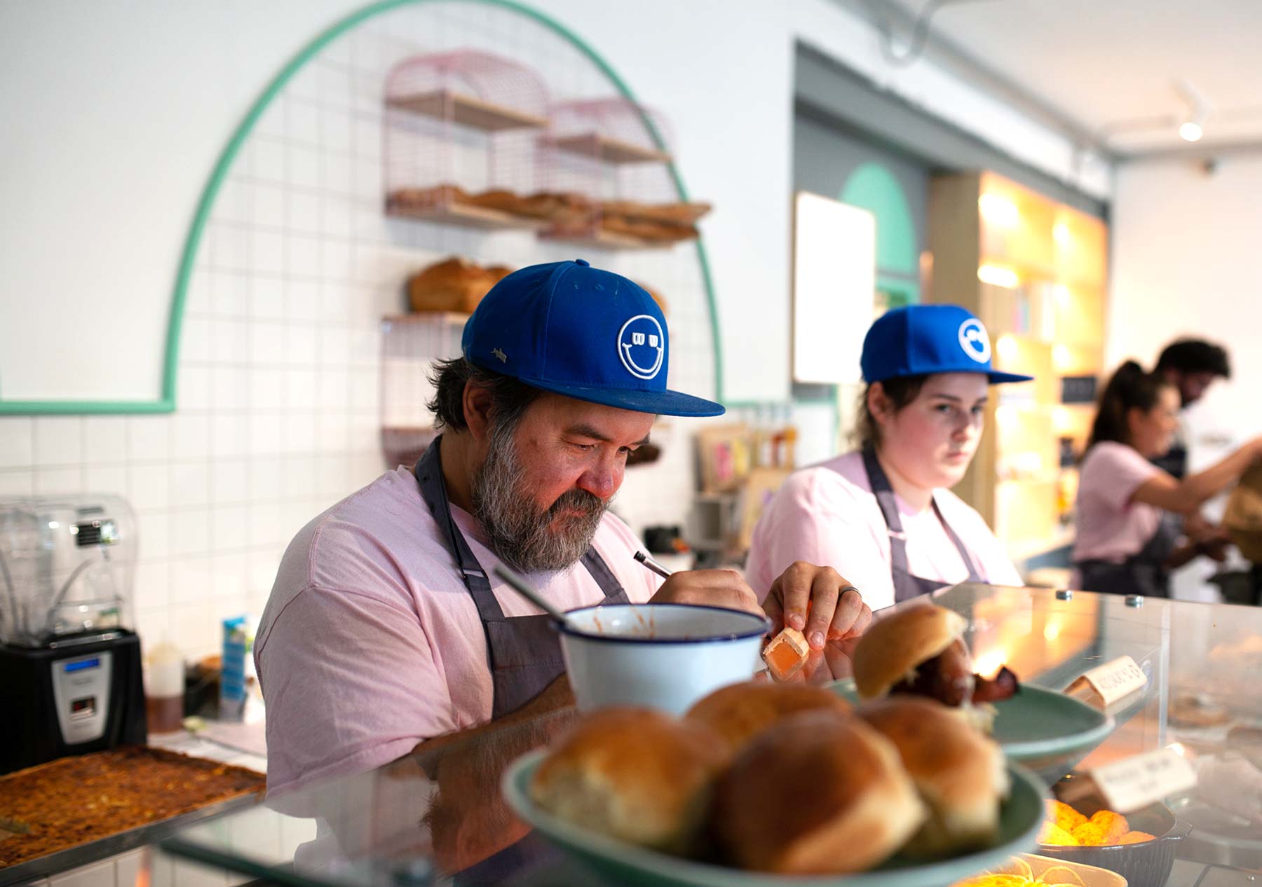
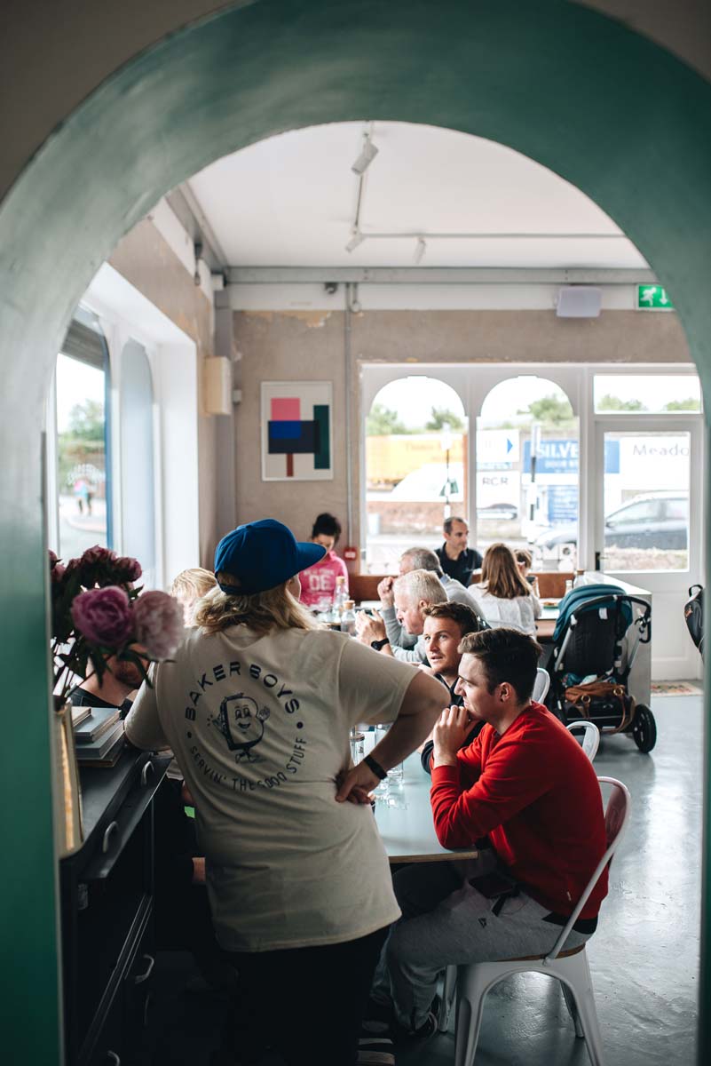
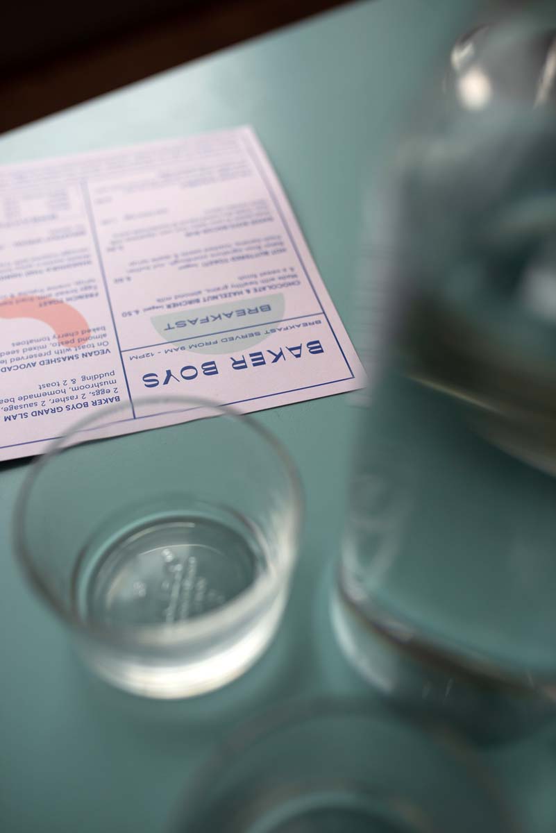
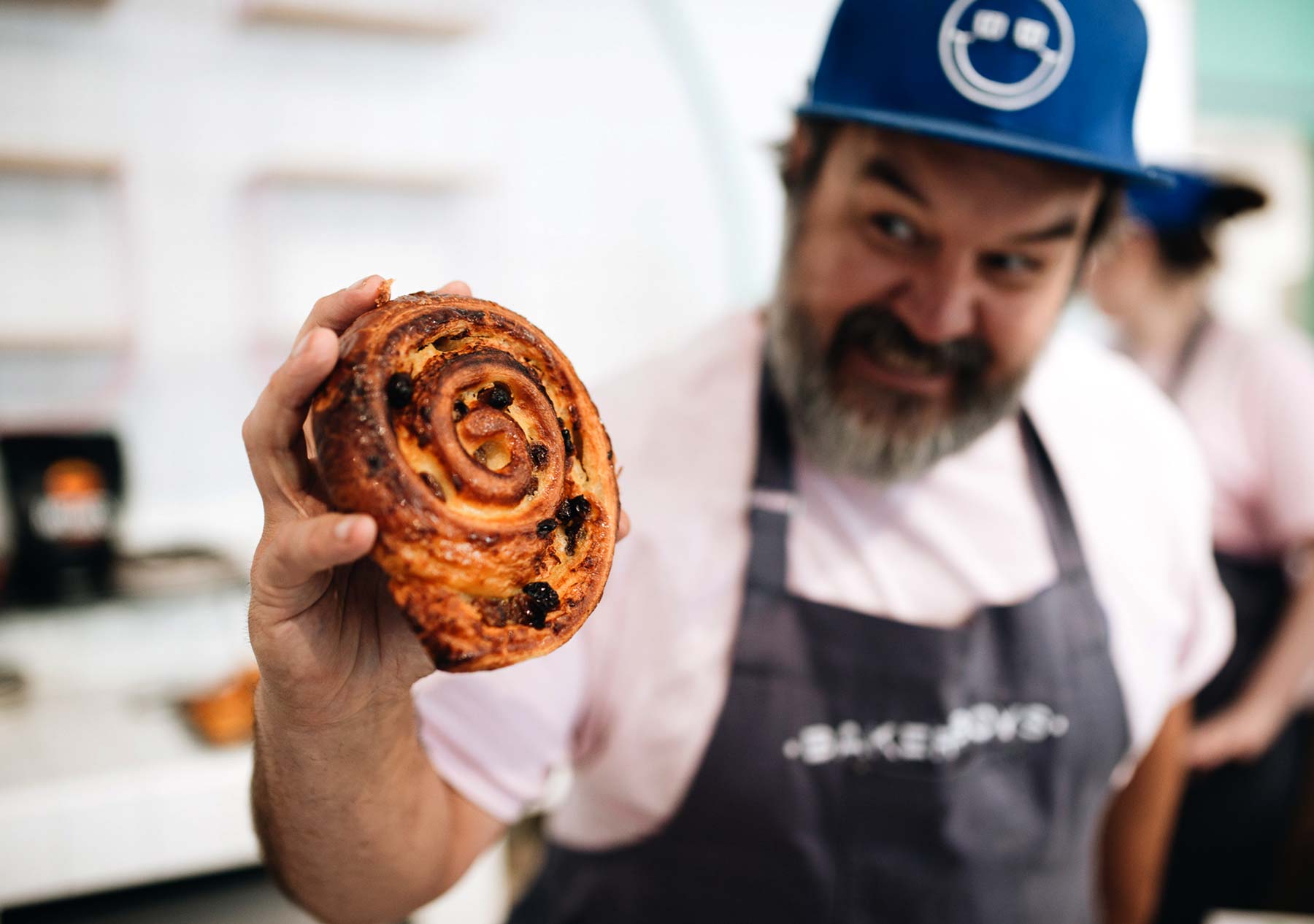
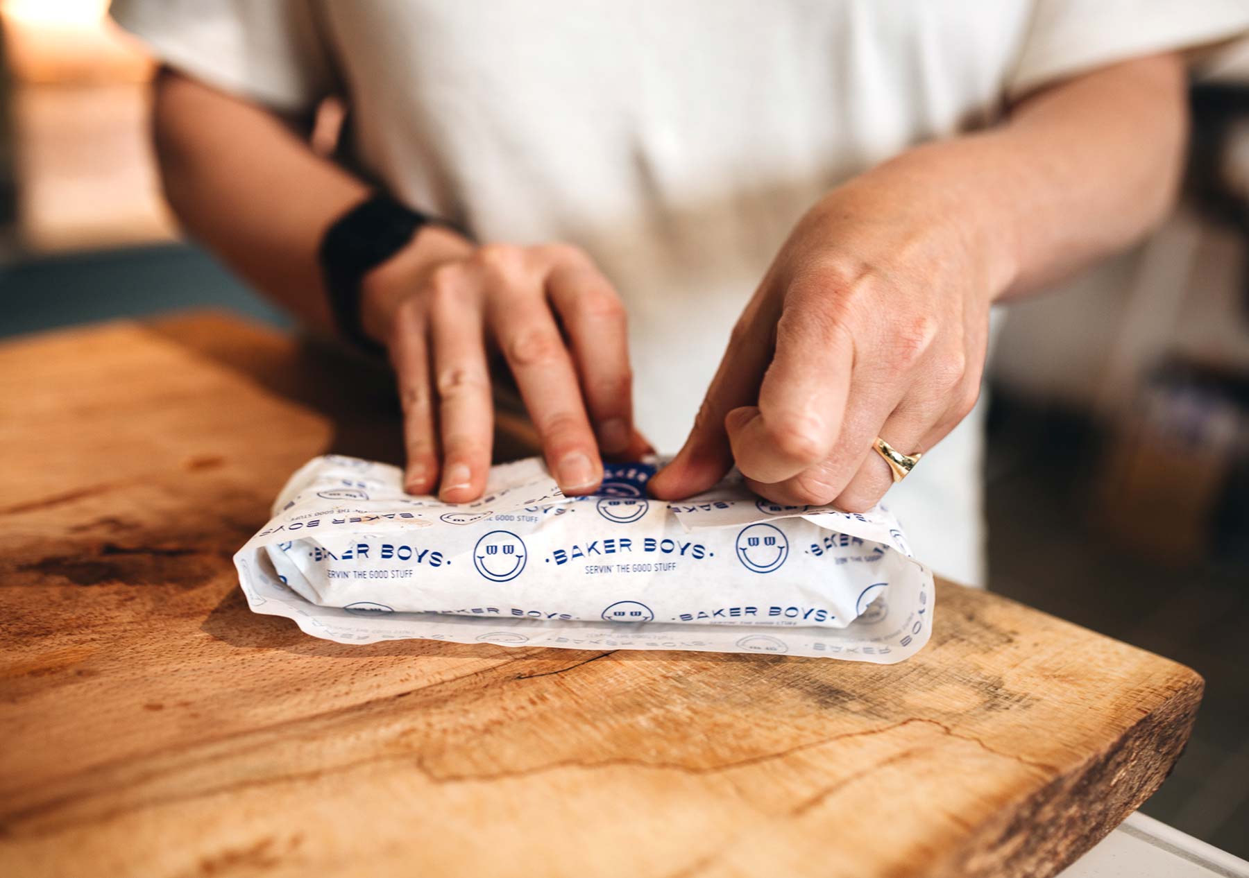
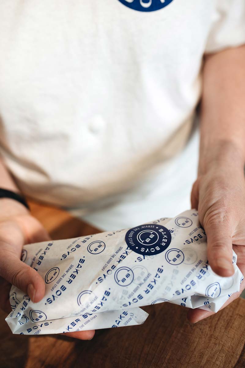
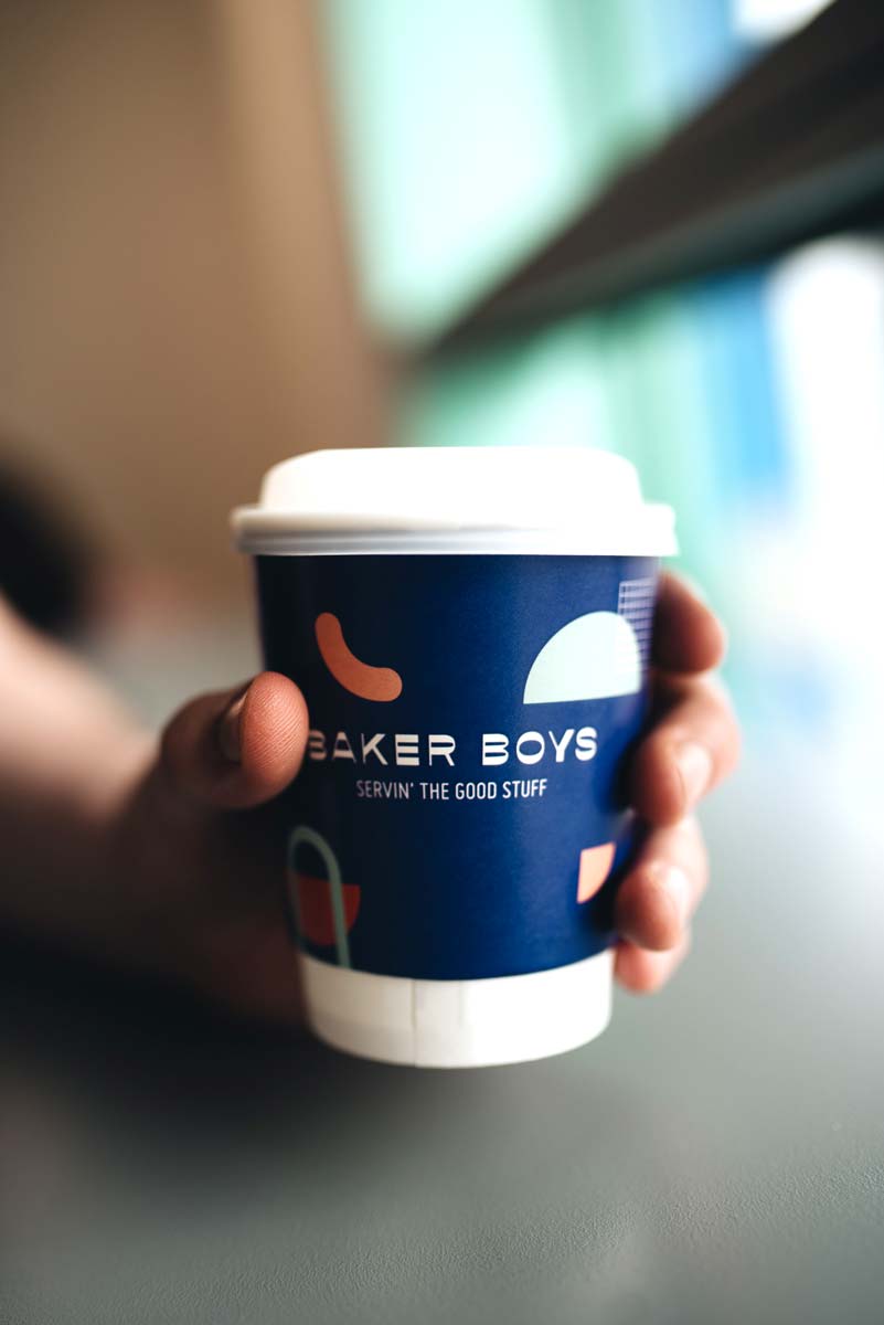
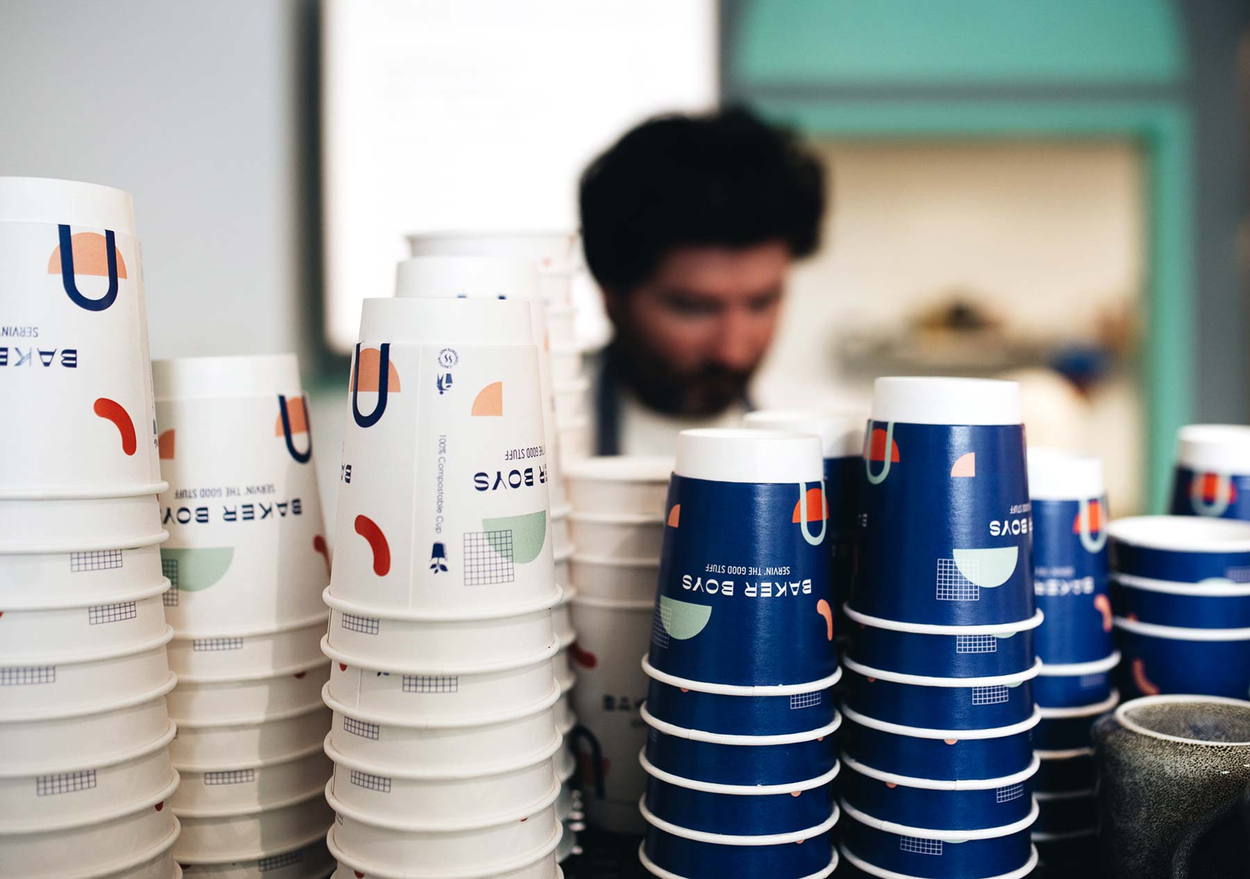
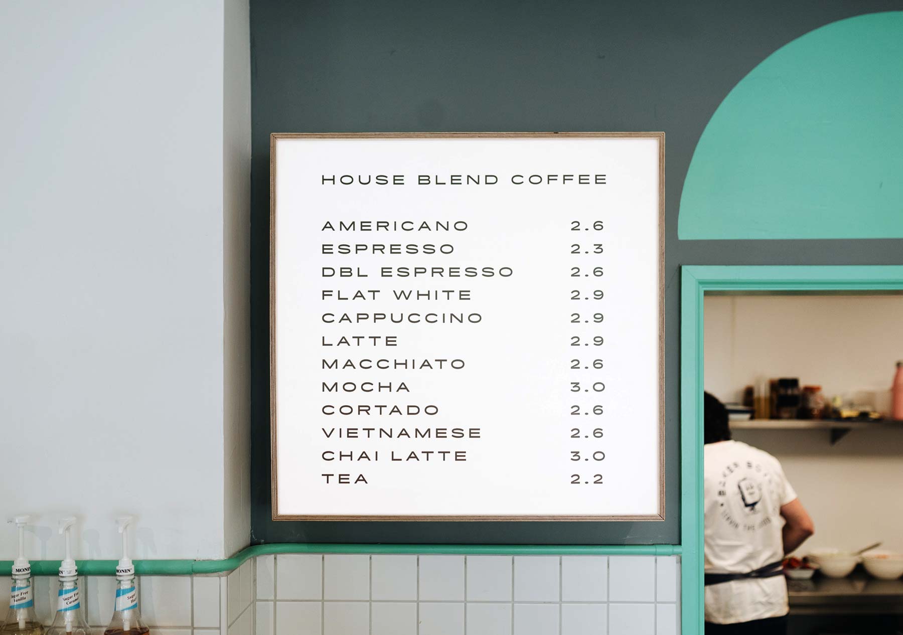
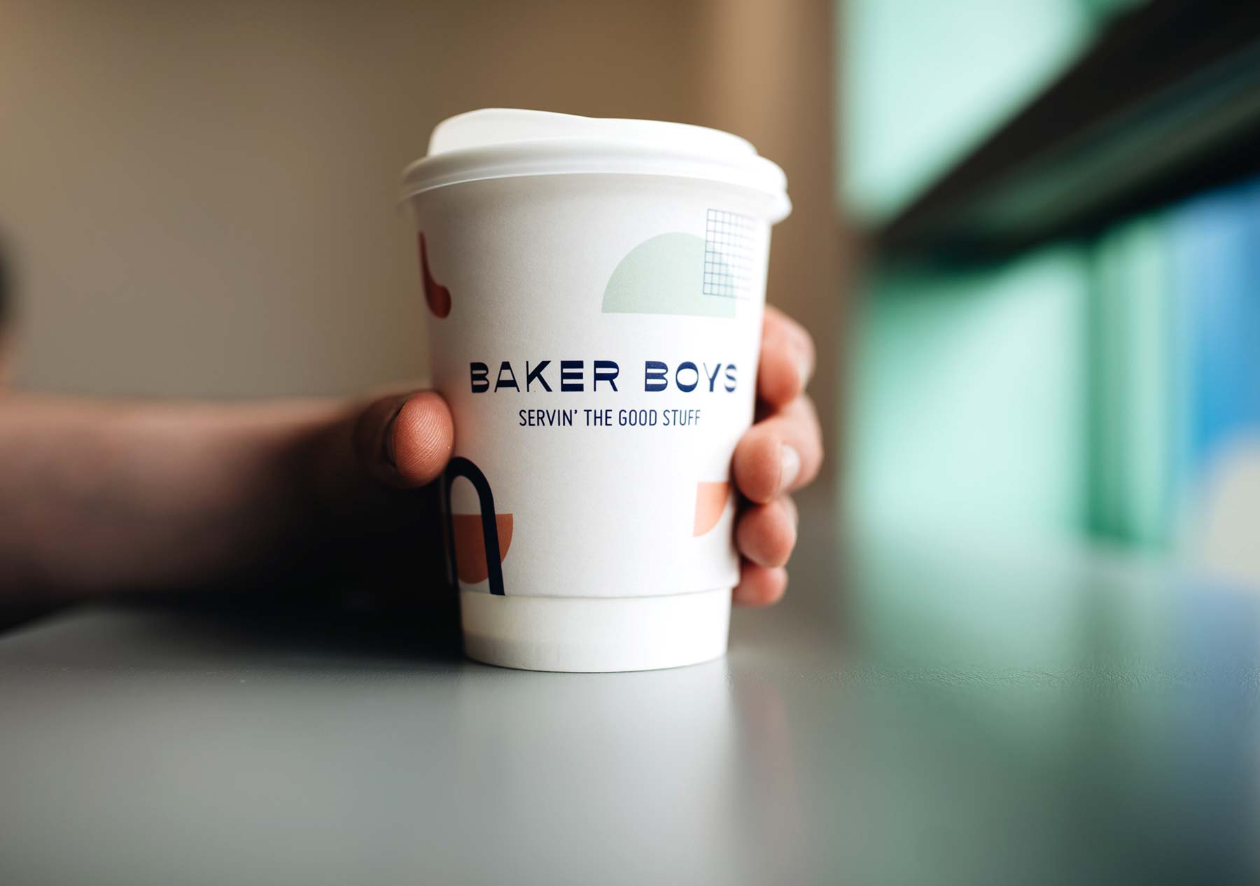
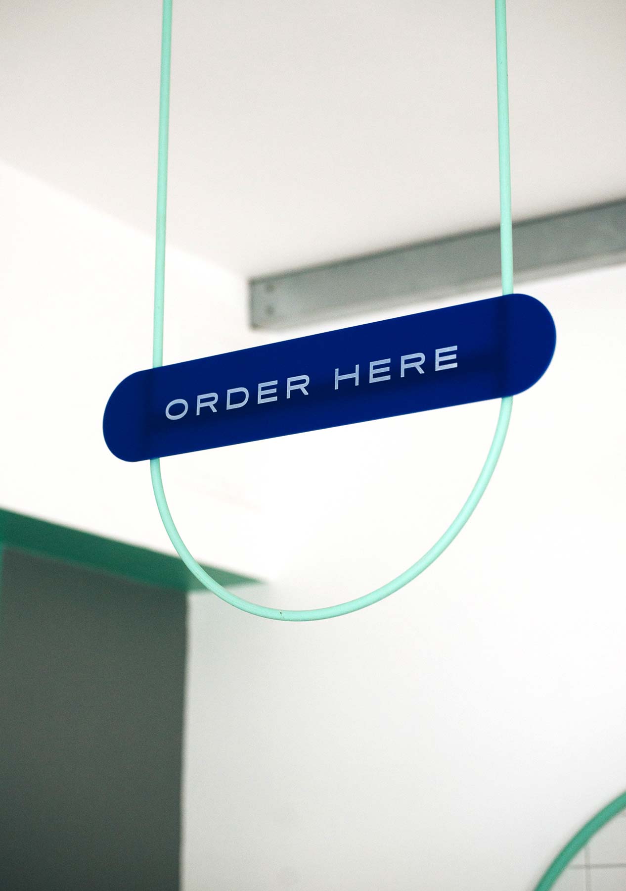
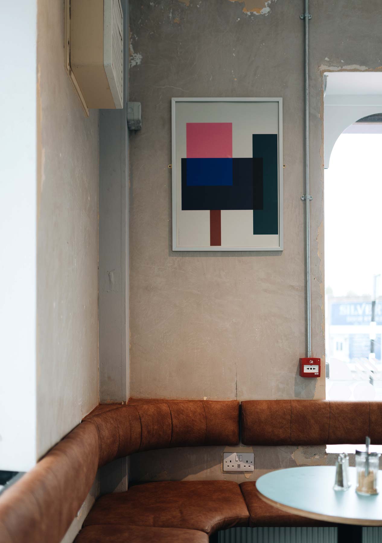
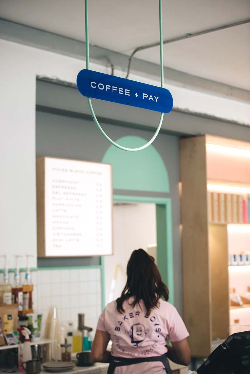
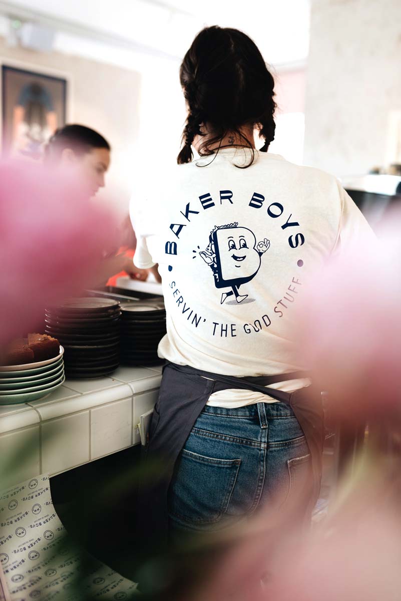
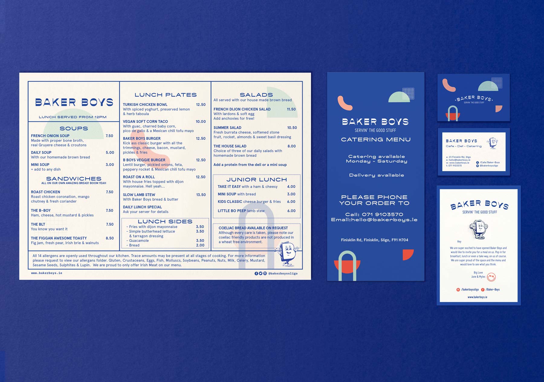
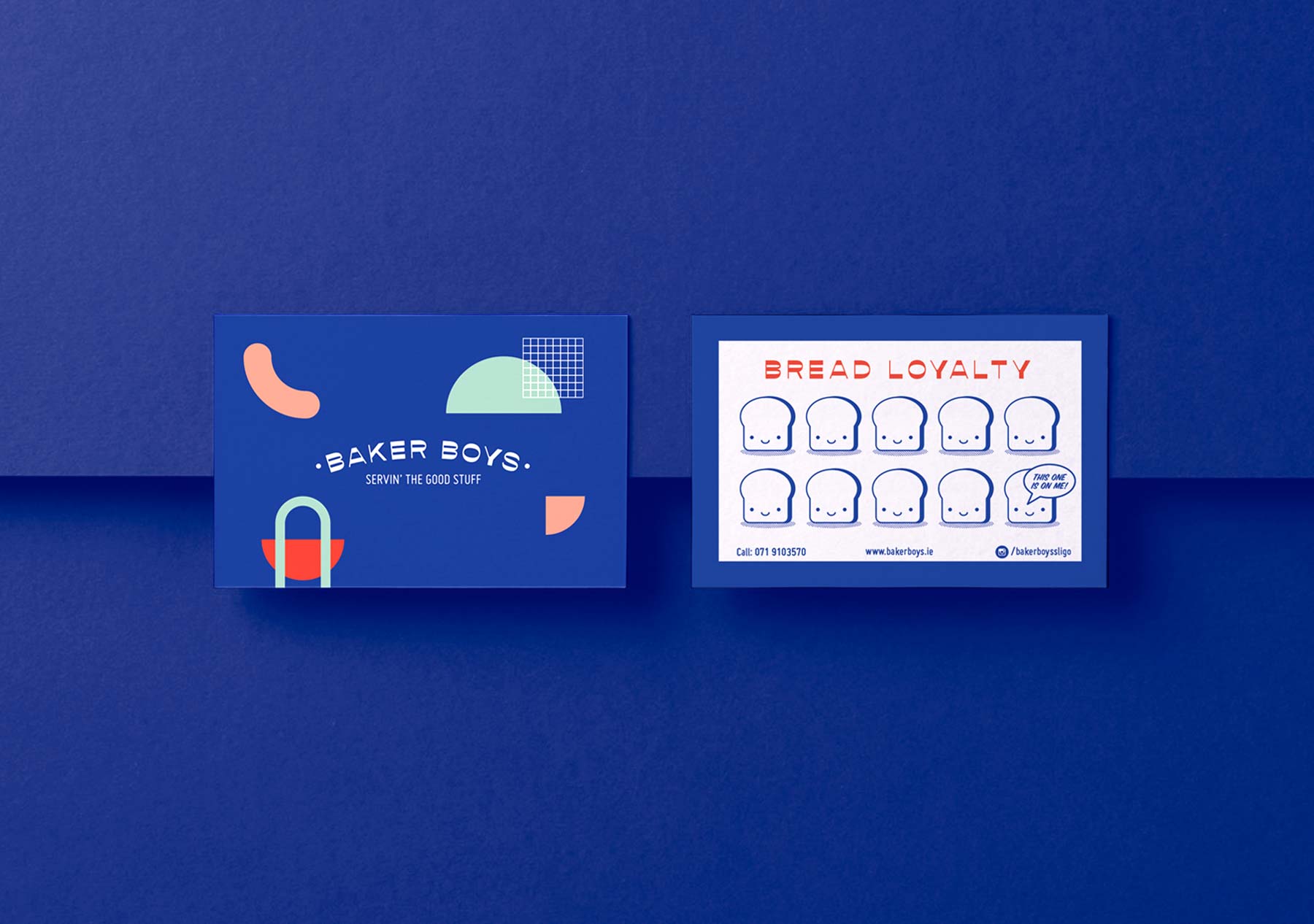
We were approached by Jane and Myles the owners of the popular seaside cafe Shells to create the brand and identity for their new Baker Boys project. The premises is situated in the dock / industrial area of Sligo town. They wanted to create a fun, bright energetic brand that would transform the dark gloomy industrial surroundings. We took inspiration from 80’s style American diners as well as creating a mascot style sandwich character called ‘Billy Baker Boy’ who is also the shape of a ‘B’. We also worked alongside Noji architects who created the beautiful interior. There was a challenge in creating a Deli and sit in Cafe under one brand which was achieved through the use of hand painted signage and varied menus.
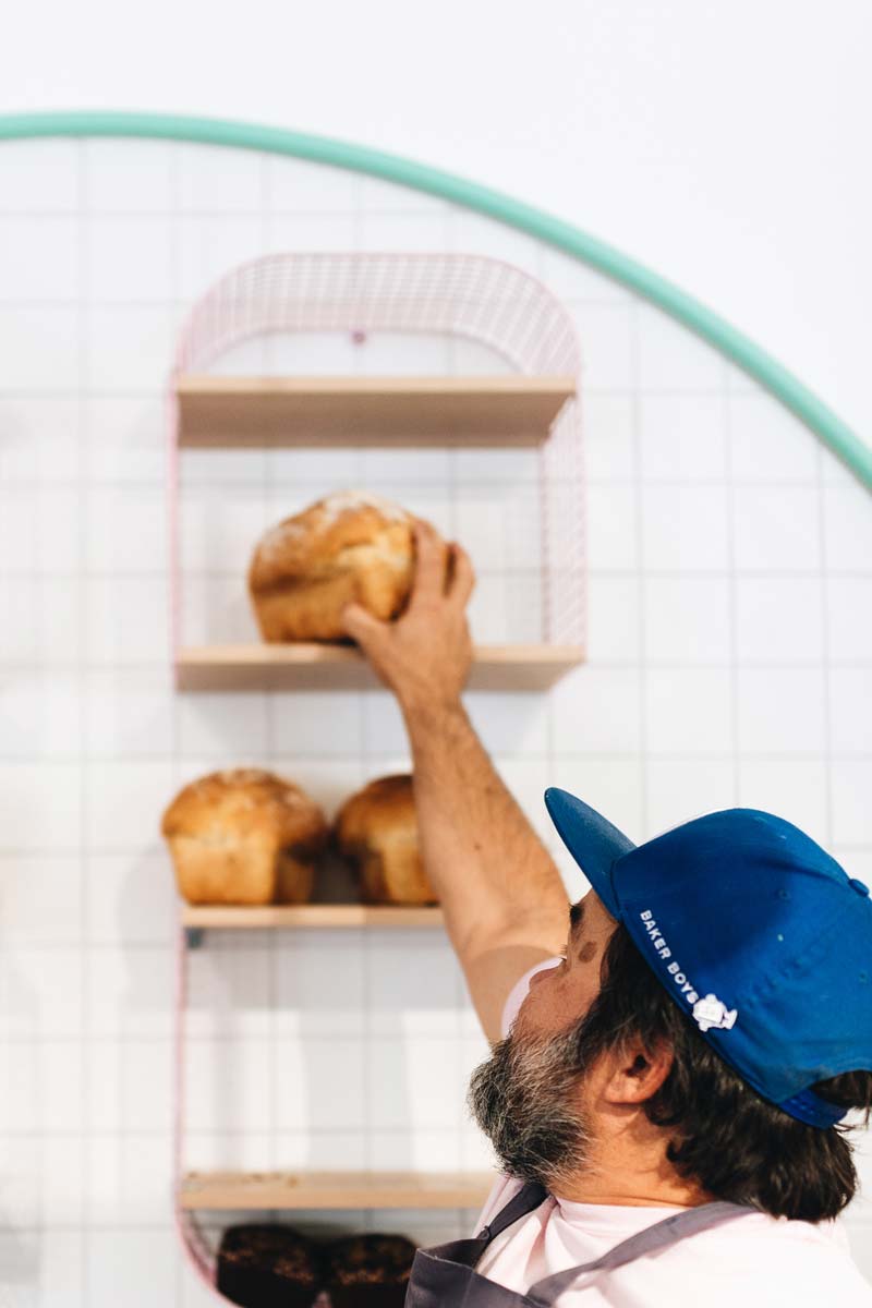
Being situated alongside the docks we took inspiration from the maritime sea flags to create a window pattern which also formed the shapes used throughout the branding. We created a smiley face that using the two letter B's from the logo that was used on merchandise such a hats as well as stamps on the loyalty cards. The website was designed to incorporate the use of the brand shapes which are responsive in the background.
Photography:
Rever Design
Signage:
Apparel By: